

What’s the issue with contrast?
In order for students to be able to follow your instructional materials, they must be able to read them. An accessibility issue related to readability is color contrast between background and text. Course content with poor contrast between text and background colors can be difficult for all student to read, but it especially poses problems for students with visual impairments.
What is a sufficient contrast?
According to Web Content Accessibility Guidelines (WCAG), the recommended contrast ratio is at least 4.5:1 for large-scale (at least 18 pt.) text and 7:1 for smaller text to account for readers with low visual acuity. Additionally, link text should have a contrast ratio of at least 3:1 compared to paragraph text.
Very high contrast, however, could also pose problems for some students. For example, students with dyslexia may have difficulty reading text on a white background, so you could choose an off-white background instead.
How can Blackboard Ally help me with contrast issues?
Ally’s has a contrast check that verifies if there is enough contrast between text color and background color. Ally uses contrast requirements specified as part of the WCAG 2.1 AA guidelines.
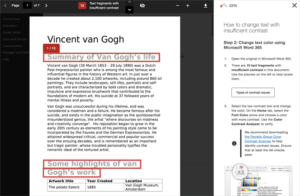
When Blackboard Ally flags a document for contrast issues, you can view a preview of the issue in your document:
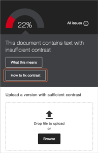
To fix the issue, Ally provides step-by-step guidance when you click the “How to fix contrast” button:
Blackboard Ally’s Fix Text Contrast webpage includes the following guidelines for ways to fix color contrast:
- Use fonts with wide character strokes.
- Use a font size of at least 12px. If using a font with thin character strokes, use at least 16px.
- Only use “thin” fonts on dark backgrounds.
- Use light text on dark backgrounds.
- Use dark text on light backgrounds.
- Avoid these color combinations:
- Green and red
- Green and brown
- Blue and purple
- Green and blue
- Light Green and yellow
- Blue and grey
- Green and grey
- Green and black
Not sure if your text has enough contrast? Use the Colour Contrast Analyser from The Paciello Group to check.
Learn More
Learn more about making our course materials accessible to all students by checking out CITL’s Accessibility Toolkit for more resources on accessible teaching.
